When Warren Buffett, the man widely regarded as the greatest investor of the 20th century devises a tool to measure market danger — and that tool just hit an all-time record high — it’s worth paying attention. Especially if retirement is anywhere on your radar.
The “Buffett Indicator” isn’t a new concept. Warren Buffett introduced it back in a 2001 Fortune magazine op-ed, calling it “probably the best single measure of where valuations stand at any given moment.” It’s straightforward: divide the total value of all U.S. publicly traded stocks by the country’s gross domestic product (GDP). What you get is a ratio that tells you whether the stock market is running ahead of — or in sync with — the actual economy producing the wealth behind it.
Right now, that ratio is sitting at an all-time high.
The Numbers Are Impossible to Ignore
As of the most recent data, the Buffett Indicator stands at 232.6% — the highest reading ever recorded. To understand how alarming that is, consider some historical context: Buffett himself wrote that when the ratio approaches 200%, investors are “playing with fire,” pointing to 1999 and 2000 — right before the dot-com bubble burst — as the last time it reached that threshold.
We’re now more than 30 percentage points past that warning line.
According to GuruFocus, which tracks this ratio daily, the current TMC/GNP reading as of April 23, 2026 sits at 227.4% — the highest point in more than five decades of recorded data. The math is stark: U.S. equity markets now represent more than double the size of the entire American economy.
Current Market Valuation calculates the indicator at 230% as of late 2025 — approximately 2.4 standard deviations above the long-term historical average, placing it firmly in “Strongly Overvalued” territory.
To translate that into plain English: the stock market has never been this stretched relative to economic reality in recorded history. Not in 1929. Not in 1999. Not ever.
What Happened the Last Few Times This Indicator Flashed Red
History doesn’t repeat exactly, but it rhymes loudly enough to warrant attention.
The Buffett Indicator flagged every major market bubble in modern financial history. Before the 2000 dot-com crash, it hit 146%. Before the 2008 financial crisis, it reached 109%. Today it’s at 232%. By comparison, both of those prior warnings look modest.
In the period following the dot-com bubble burst and during the 2009 financial crisis, the indicator fell below 70–80%, signaling significant undervaluation — and those periods turned out to be among the best long-term buying opportunities of the past generation. The cycle works both ways — but right now, the arrow is pointing in the wrong direction for anyone heavily concentrated in equities with no hedge in place.
Based on current valuations, models project the stock market to return approximately -0.7% annually over the next eight years — meaning investors sitting in a pure equity portfolio today may be staring at close to a decade of negative real returns if the historical pattern holds.
It’s Not Just One Indicator Screaming
The Buffett Indicator gets the headlines, but it’s not operating in isolation. Multiple valuation models are currently aligned in the same direction.
The Price/Earnings model, the Price/Sales model, and the Buffett Indicator model are all independently flashing “Strongly Overvalued” simultaneously — a convergence that analysts rarely see across multiple methodologies at once.
Layer on top of that the geopolitical pressures still reverberating from the Middle East, elevated borrowing costs compared to the ultra-low-rate era, and fresh uncertainty over whether inflation will stay stubbornly high or prompt an aggressive Fed response— and the picture that emerges is one where the traditional 60/40 portfolio faces headwinds from multiple directions at once.
U.S. stock/bond correlations soared to 30-year highs during the post-COVID inflation spike and Fed tightening cycle — which matters because the whole premise of owning bonds as a hedge against a stock decline has been quietly falling apart. When stocks and bonds fall together, there’s nowhere to hide inside a conventional portfolio.
Except one place.
Gold: The Asset That Doesn’t Care About Valuations
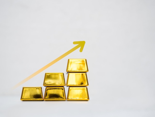
While equity markets have been stretching themselves into historically dangerous territory, gold has been doing what gold does.
From 2024 through early 2026, gold prices surged to new highs, driven by geopolitical uncertainty, record investment demand, and substantial buying from emerging market central banks — the kind of institutional, multi-year demand that doesn’t evaporate overnight.
As of April 23, 2026, gold is trading at $4,713 per ounce, having reached an all-time high of $5,595 in January 2026. That’s a move that has significantly outpaced the broader equity market’s real return over the same period.
The forward outlook is no less compelling. J.P. Morgan Global Research is forecasting gold prices to average $5,055 per ounce by the final quarter of 2026, with the metal rising toward $5,400 per ounce by end of 2027 — driven by central bank demand, inflation hedging, and the continued global de-dollarization trend.
Gold has low correlation with other asset classes, which means it can act as insurance during falling markets and times of geopolitical stress — a characteristic that makes it particularly valuable when stock and bond markets are moving in the same direction.
For retirees or near-retirees, that last point is critical. If your entire retirement strategy depends on stocks continuing their historically unprecedented run, the Buffett Indicator is telling you to take a hard look at that assumption.

Why Physical Precious Metals Belong in the Conversation
Financial advisors commonly recommend a 5% to 15% allocation to precious metals for portfolio diversification. Conservative investors and those with concerns about systemic risk often hold toward the higher end of that range.
Physical ownership eliminates counterparty risk entirely — unlike gold ETFs or mining stocks, physical gold coins and bars represent direct ownership with no dependence on any institution’s solvency. This distinction matters most during the crisis scenarios where gold has historically performed best.
And when it comes to retirement accounts specifically, a Gold IRA allows investors to hold physical precious metals inside a tax-advantaged structure — combining the long-term store-of-value properties of gold with the same tax treatment as a traditional retirement account.
With the Buffett Indicator at its highest level in recorded history, the case for meaningful precious metals exposure in a retirement strategy has rarely been stronger.
Your Nest Egg Deserves a Second Opinion
The Buffett Indicator isn’t a crystal ball. No single metric predicts market crashes with precision. But when the indicator that once warned investors ahead of the dot-com collapse is now 30+ percentage points higher than that prior warning level — that’s a signal serious enough to start a real conversation about what’s protecting your retirement.
Markets can stay irrational longer than most people expect. But they don’t stay irrational forever.
If you’re within 10 years of retirement — or already in it — now is the time to talk to someone who knows precious metals.
Call GoldenCrest Metals at 833-426-3825 to speak directly with a specialist who can walk you through your options for protecting and diversifying your nest egg. Whether you’re exploring a Gold IRA, physical delivery, or just want to understand how precious metals fit your retirement picture — GoldenCrest’s team is ready to have that conversation.
GoldenCrest Metals | goldencrestmetals.com | 833-426-3825
Don’t wait for the indicator to matter. By then, it already has.
This article is for informational purposes only and does not constitute financial or investment advice. Past performance of any asset class is not indicative of future results. Consult a qualified financial advisor before making investment decisions.